Web design is constantly evolving and those of us who implement solutions for the Web must try to help in that evolution by taking a little risk to help improve it. Finally, trends are the result of the risk taken by those who have ventured to go beyond what is established. .
This article is based on the presentation made by Aga Naplocha at Frontend United held in Utrech, the Netherlands in June 2018, this conference caught our attention and we want to share our summary.
Aga Naplocha is a code designer and front-end developer from Poland who participated in this important event by giving a talk. As well as her office job, she also has her own project, a non-profit organization called the Awesomes, to encourage and teach designers how to program and develop in this field, she also has another program to teach them how to animate SVGs for the web.
When she was just starting her career, she was given the task of creating a website but she didn't know how or where to start, she felt confused, she lacked inspiration and she saw that everything was somewhat boring in the world of web design, and therefore, even He thought about changing jobs.
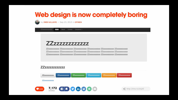
Like any good designer, the internet is very important whether as a tool, source of information, etc., but she couldn't find anything that would put her on the right path and ignite her spark of creativity, so she decided to look for answers for it elsewhere. . It occurred to her to look for inspiration and a new air outside the network (online), outside of the boring websites, so she looked in the real world (offline).
What he got as an answer to what gave him so much tastelessness were a friend's printed magazines, in which he discovered innovative and inspiring solutions in terms of design.
He says, “The peculiar thing about this case is that almost everyone believes that print design, publications, press and so on are dead, but that is where a whole new world can be found: illustrations, graphic material, the distribution and arrangement of elements and how all of this plays a very important role when it comes to supporting the content itself. What doesn’t happen on the web lately, where all you see are blocks, all with the same type of “uniform” that everyone wears, just with a change of colors and typography.
When he returned to his online world, he searched for “brutalist websites,” which are sites that break away from the norm in terms of conventional web design, and treat their information and content in a way that clashes with what is already established. Many of these do not follow the rules of user usability very well and try to evolve and test different solutions to those already known and mostly accepted by the community.
Many companies do not have the courage to go a little further and try new terrain, but one of them is Bloomberg, a very daring proposal, but one that works very well.
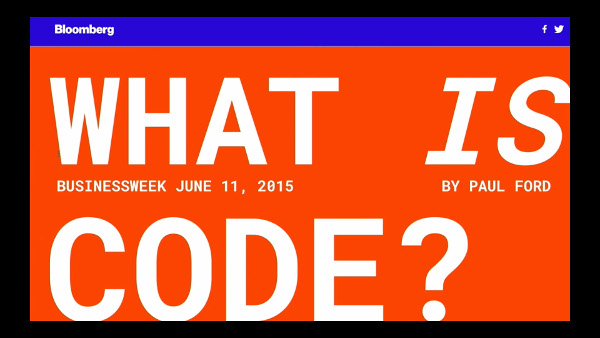
And this is where CSS comes into the game, taking inspiration from print magazines and bringing them to the web.
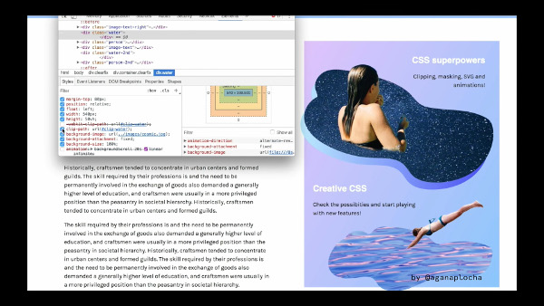
Aga talks about Clipping Path, a property that allows you to create interesting designs and implement them on the web without using image editors (for example, Photoshop). The possibilities are endless, limited only by creativity. In short, they are “masks” that when applied give a unique, interesting and moving aesthetic to the site.
Since everything is implemented with CSS and HTML code and with SVG vectors, everything will have a minimum weight and size; which is ideal, since this translates into faster loading of information and less data transfer, since on the other hand PNG files are large in size.
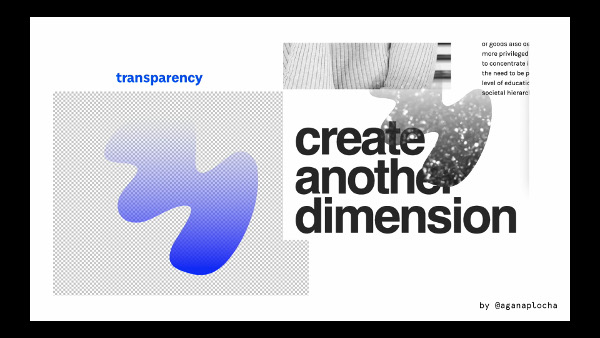
Masking is another property, but unlike clipping path , it can be given a transparency (Alpha Channel) which also supports gradients. For this we do not work with vectors but with images.
With this type of properties you can give visual treatments to images and give a more interesting look and feel to websites.
The problem is that currently some browsers still do not support these properties, but over time they will become more adapted.
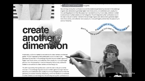
The great thing about SVGs is that they are accessible, searchable, and selectable - everything is within the code, which is not the case with regular images.
Chaos is a trend in web design this year, in which all this is welcome and helps an evolution of the web in which everything is much less boring, while maintaining its good usability.
Of course, the website has to have good accessibility and usability, and offer a good user experience, so such extreme implementations could only be experimental, so they are not always applicable and/or the best solution to follow. It all depends on the project to which it is applied and whether it is implemented in the best way.
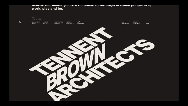
Taking the risk of doing something new and taking a new path is difficult, but like everything in life, someone had to do it to get to where we are today and someone is going to have to continue doing it to continue progressing, not only in the field of design but in all fields in general.
