In addition to improving the experience for editors, another big area of improvement for end users are features that make Drupal 8 mobile-friendly by default, to keep up with the global explosion of mobile devices around the world.
Mobile first
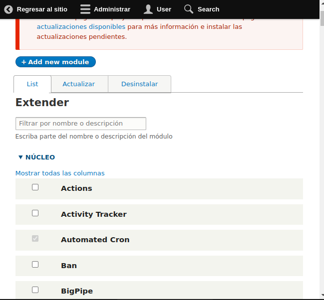
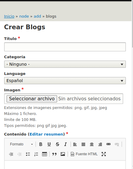
Users will find that everything in Drupal 8 has been designed with mobile devices in mind, from the installer to the modules page. Even new features like in-place editing are designed to work on tiny screens.

Everything is responsive (Themes, Images, Tables, etc.)
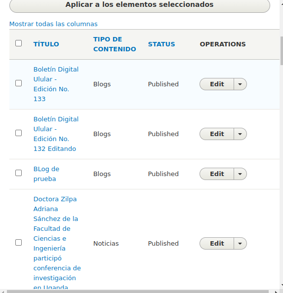
In order to support the unimaginable range of devices, Drupal 8 incorporates responsive design into everything it does.
All core themes are now responsive, and automatically rearrange elements such as menus and blocks to fit properly on mobile devices (if the screen is too thin, horizontal elements are changed to a vertical orientation). Responsive image functionality is also built-in, so images displayed on a desktop computer are shrunk to fit on a tablet or smartphone.

Drupal 8 also provides tablet support, so columns on tablets can be set to "high, medium or low" importance. On wide screens, all columns are displayed, but as the screen size is reduced on tablets, columns of lower importance start to move down so that everything fits nicely. This API is also built into the Views module, so it is possible to configure screen sizes from the admin.

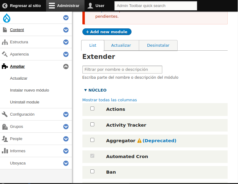
Mobile friendly toolbar
Drupal 8 now has a shiny new administrative toolbar, which automatically expands and orients horizontally on wide screens, and shrinks to icons and orients vertically on smaller screens.

Pre Visualizer for Responsive Behavior
The Responsive Preview module provides an easy way, integrated into the CMS, to quickly check how the site looks in responsive, in a customizable way without having to spend $25,000 on hardware. It's possible to flip between landscape and portrait mode, too.
One of the biggest factors that can make or break the mobile experience is the performance of a website. As a result, a lot of work has been done in Drupal 8 to minimize the front-end footprint. For example, in many cases, jQuery has been replaced with native JavaScript, and Drupal 8 starts with zero JavaScript file loading for anonymous visitors. Additionally, JavaScript-intensive features like the Overlay module have been removed in favor of lighter, mobile-friendly alternatives.
Taken from Acquia.com
Translated by Seed
