It was in June 2007 when things started to change, Apple had launched the iPhone and for the first time the user had the opportunity to have a true web browsing experience from their mobile phone.

Ethan Marcotte was the one who coined the term “Responsive Web Design” in his article http://alistapart.com/article/responsive-web-design where he expressed the idea of taking what was already known as flexible layouts and images combined with the nascent Media Query and take this to an adaptive concept. Ethan stated that clients were making requests to have a version of the site adapted for the already consolidated iPhones and this was being done by creating subdomains that had a structure completely designed and adjusted for the sizes and behaviors of the iPhone, however, if this continues, soon Another subdomain and another structure would have to be created for the Ipad and then for the N90 etc. So it started from the concept of “Responsive Architecture” that proposes how physical spaces can respond to the presence of people who pass through it by combining the use of flexible materials with sensors and robotic devices that react to change, this by extrapolating it to the web was what was born as the Responsive Web .
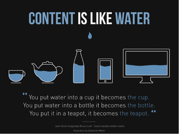
In other words, responsive web design is about how content is presented appropriately according to the orientation and device that is accessing it. That is why it is important to understand that it is not only about making it look appropriate to the screen size but also about making it fit the best experience that can be had from the device that is being accessed.
Responsive web design is nowadays something that is a natural part of the development of any website, however the technologies that allow it require working with modern browsers, although today that is almost taken for granted; You should keep in mind that a few years ago browsers did not have support, so rule out good support, for example in versions of Internet Explorer below 9, Internet Explorer? Does it still exist? You would be surprised at the number of internet cafes that don't know what updating is, the same thing happens on mobile phones and tablets, you will notice that in versions of Android 2 and below it is quite a challenge.
Google gave the next breaking point in 2015 when it announced that from April 21 of that year, websites that were not responsive were going to suffer a drop in their reputation since it was considered a failure in usability for mobile phones. It was necessary for a large company to take things seriously for the rest to react. From that moment on, governments took seriously the problem of rigid websites that they had had for years and began a modernization process.

The website has been modernized and with it new requirements have been born for the diversity of users and experiences it offers, years ago the website stopped being static and boring, today users expect to have a good experience with easy-to-read content from any of your devices and even more so that the response time is fast, it is a balance that occupies all the areas involved in the development of information for the Web.
Image 1 by Stephanie Walter
